Case Study
Dick's Sporting Goods
Competencies
Usability TestingDick's Sporting Goods, Inc. is a full-line sporting goods retailer offering brand name sporting goods equipment, apparel, and footwear in a specialty store environment. The company has 268 stores in 34 states primarily throughout the Eastern half of the U.S.
Project Goals
The purpose of this study was to create and facilitate a usability Testing study that would give Dick's Sporting Goods first-hand feedback from their prospective users on whether or not the website redesign fits their needs.
The specific objectives of this usability study was to find out the following information from three different end user groups:
1) Can they use the new features and functionality of the website to accomplish their goals
2) Are they able to get the information they need easily
3) Are they able to find the items they want and purchase them
4) Does the interface cause them any undo frustration
Methodology
Usable Interface conducted one round of usability testing on the existing design comps with 15 end users (5 per user group). The duration of the tests were be an hour long. The testing was conducted in-person over a 3 day period.
Media
Project Kick-off
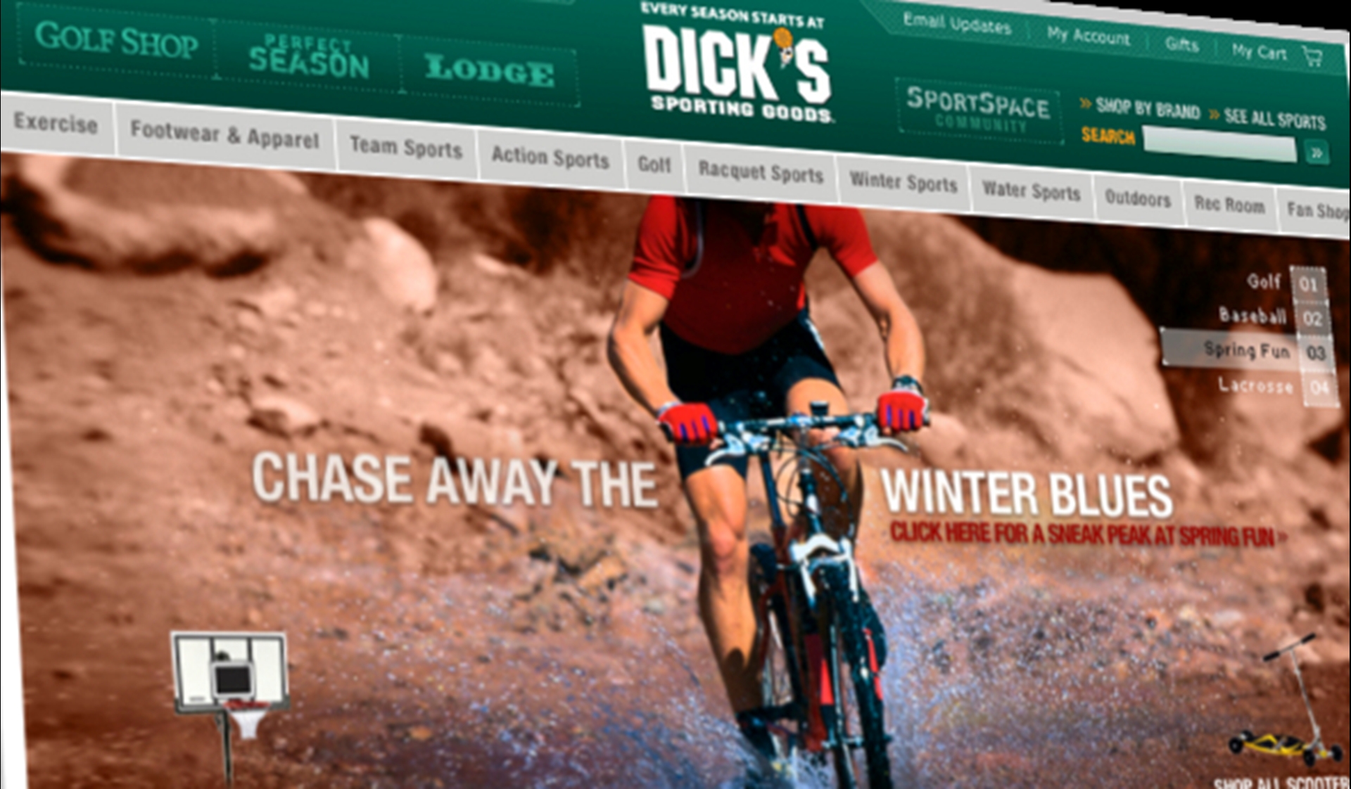
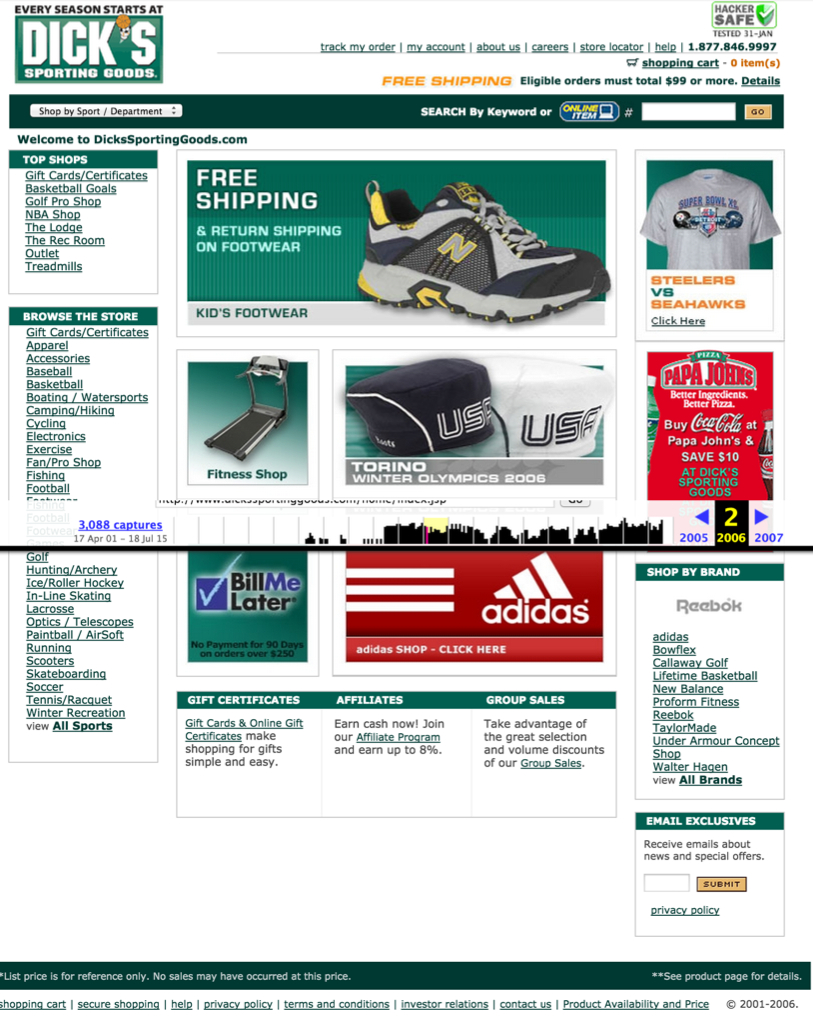
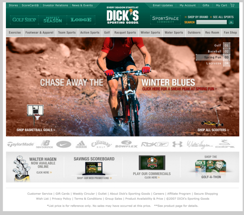
Dick's knew that they were taking a chance by launching such a visually different website. They needed to make sure that the new design would be a hit with their users before they launched it.
Usable Interface's Kyle Soucy worked with the Dick’s IA and design team to create a usability test that would reveal the information they needed to learn about the new design.
Creating a Test Plan
In order to create a study with as little bias as possible, we needed to make sure we recruited the right people to participate in the study. We identified three different user groups: Golf Pro Shop Users, Lodge Users, and The Perfect Season Users. Once they were identified, we created a recruiting screener and started recruiting respondents. While we were recruiting users we decided what tasks we wanted each user group to perform. We knew that each group had different needs, so we made sure to craft a study that would test if those needs were being fulfilled in the new design.
Usability Testing
A total of fifteen respondents participated in this study (five respondents per user group). An HTML prototype of the new website design was created for the usability test. Usable Interface spent an hour testing each respondent separately.
Project Completion
Over a period of two weeks, we were able to test the redesign of Dick’s website and deliver a full report of the findings. At the end of the project, Usable Interface presented the key findings from the user testing study to the executive team for the Dick’s website. The testing revealed some high priority problems with the product pages. Dick’s was able to fix these problems before launching a successful redesign.
"Not only was Kyle's work exceptional in every detail, but she went the extra mile in acting as an advocate for user-centered design and usability testing to the project's leadership team. I gladly welcome the opportunity to work with Kyle again."
Dave Cooksey
Information Architect
GSI Commerce, Inc.


